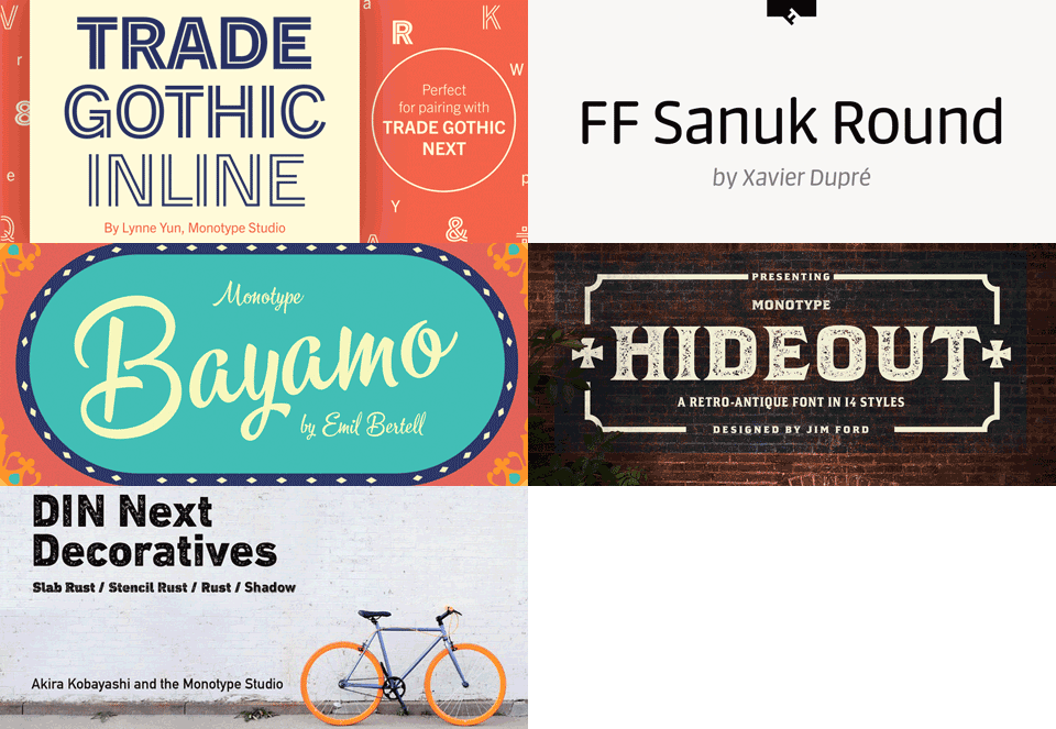
WOBURN, Mass.--(BUSINESS WIRE)--A soft and smooth sans serif, an energetic hand-drawn script, a flared and bold serif and textured variations on one of history’s most enduring typefaces highlight the recent additions to the Monotype Library.
“The new additions to the Monotype Library are some of the most creative and interesting designs we’ve seen in recent memory, and really expand the options for designers who want to add a new typographical element to their projects,” said Tom Rickner, director of the Monotype Studio. “We’re excited to release such a diverse set of designs to a community of creative professionals that’s hungry for fonts that help them differentiate their work.”
Each of these recent releases are available to customers through Mosaic™, Monotype’s cloud-based font service that provides enterprises with an easy way to discover, manage, share and deploy fonts. Individual font licenses are also available through MyFonts.com.
Trade
Gothic® Inline: A Decorative Option for a Popular Classic
Designed
as an accompaniment to the Trade Gothic Next typeface, the Trade Gothic
Inline design by Lynne Yun of the Monotype Studio is an eye-catching
addition to the family, and is a response to the growing need for bigger
type families that can handle a wider variety of environments and uses.
The family features five decorative weights that run the gamut from
elegant type that’s barely there, to sturdy letterforms that can stand
up to virtually anything. While the heavier weights convey immediate
impact—and obviously belong on posters, packaging, and other print
projects—the lighter weights are surprisingly elegant. Where the darker
weights shout, these whisper.
FF
Sanuk™ Round: A Sans Serif with Softness and Structure
The
latest addition to the FF Sanuk typeface family by Xavier Dupré, the FF
Sanuk Round design follows similar proportions to its predecessors, but
takes their original shapes and gently softens them for a smoother
aesthetic. The sans serif provides designers with a balance of formality
and playfulness, and its mix of soft and rigid qualities makes it well
suited for corporate communications, or for making serious topics more
casual and approachable.
Bayamo™:
Combining the Freehand Joy of Sign Writing with the Flexibility of
Digital Design
Mimicking the loops and flourishes of a brush,
the Bayamo typeface by Emil Bertell possesses an energetic personality
that taps into the nostalgia for letterforms hand-crafted by pen and
paint. The design features a number of contextual alternates, meaning
that lowercase letters change depending on what’s next to them—creating
more varied word shapes, and lending the design more of a “hand-made
feel.” The typeface is a good choice for branding, packaging and
headlines, and other environments where designs and companies need an
attention-grabbing tone of voice.
Hideout™:
A Wild West-Inspired Sans Serif on the Wrong Side of the Law
Designed
by Monotype type designer Jim Ford, the Hideout typeface celebrates
quirkiness, blending aspects of a typical flared serif style with a
square sans serif. The design’s expressive angles demand to be used at
large sizes, which reveal some of the details that lend it such
charm. The Hideout typeface is also impressively adaptable, with 14
weights including a set of decorative alternates, and ghost versions
that could have been taken straight from faded “Wanted” posters. There’s
even a few brick patterns and antique printers fists hidden in the font,
for designers that really want to make the most of the typeface’s quirks.
DIN®
Next Decorative: A Textured Take on the Classic Sans Serif
Design
The original DIN typeface is a century-old design that
has remained sturdy, reliable, recognizable and classic since its
introduction. The DIN Next Decorative family is comprised of DIN Next
Rust, DIN Next Shadow, DIN Next Stencil Rust and DIN Next Slab Rust.
Created to push the DIN Next family beyond its famous sharp corners and
smooth curves, the decorative cuts give the family’s stern, industrial
character some added personality.
About Monotype
Monotype empowers creative minds to build and
express authentic brands through design, technology and expertise.
Further information is available at www.monotype.com.
Follow Monotype on Twitter,
Instagram
and LinkedIn.
Monotype is a trademark of Monotype Imaging Inc. registered in the U.S. Patent and Trademark Office and may be registered in certain other jurisdictions. Mosaic, Bayamo and Hideout are trademarks of Monotype Imaging Inc. and may be registered in certain jurisdictions. Trade Gothic, FF, and DIN are trademarks of Monotype GmbH registered in the U.S. Patent and Trademark Office and may be registered in certain other jurisdictions. DIN Next and Sanuk are trademarks of Monotype GmbH and may be registered in certain jurisdictions. All other trademarks are the property of their respective owners. ©2018 Monotype Imaging Holdings Inc. All rights reserved.


